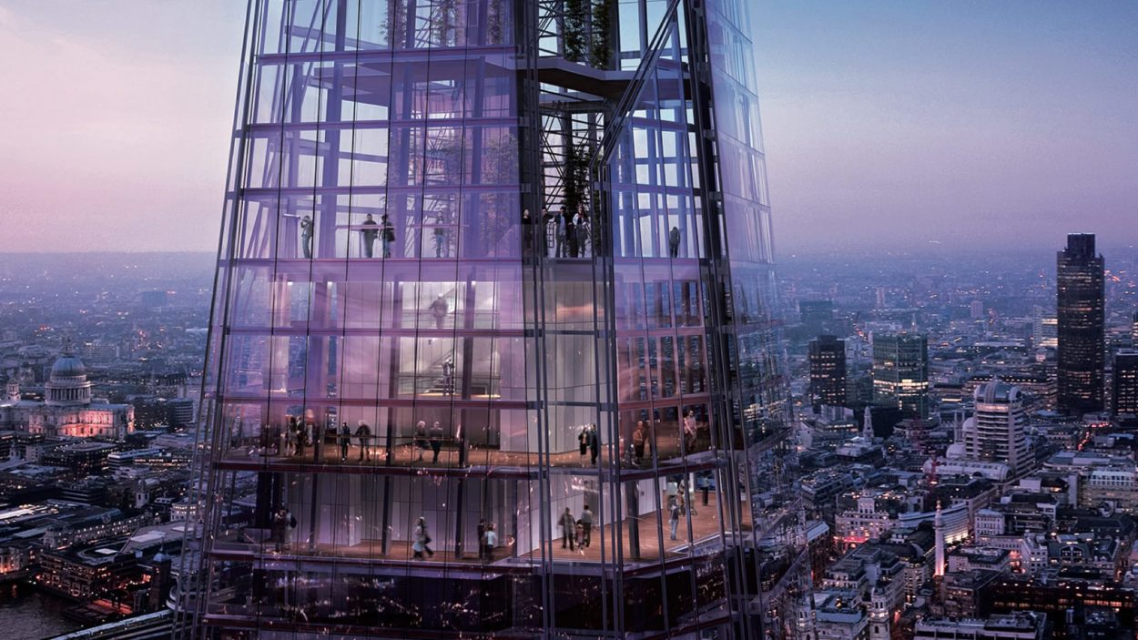
The Shard
Naming The Shard
Client: Sellar
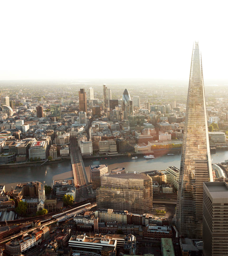
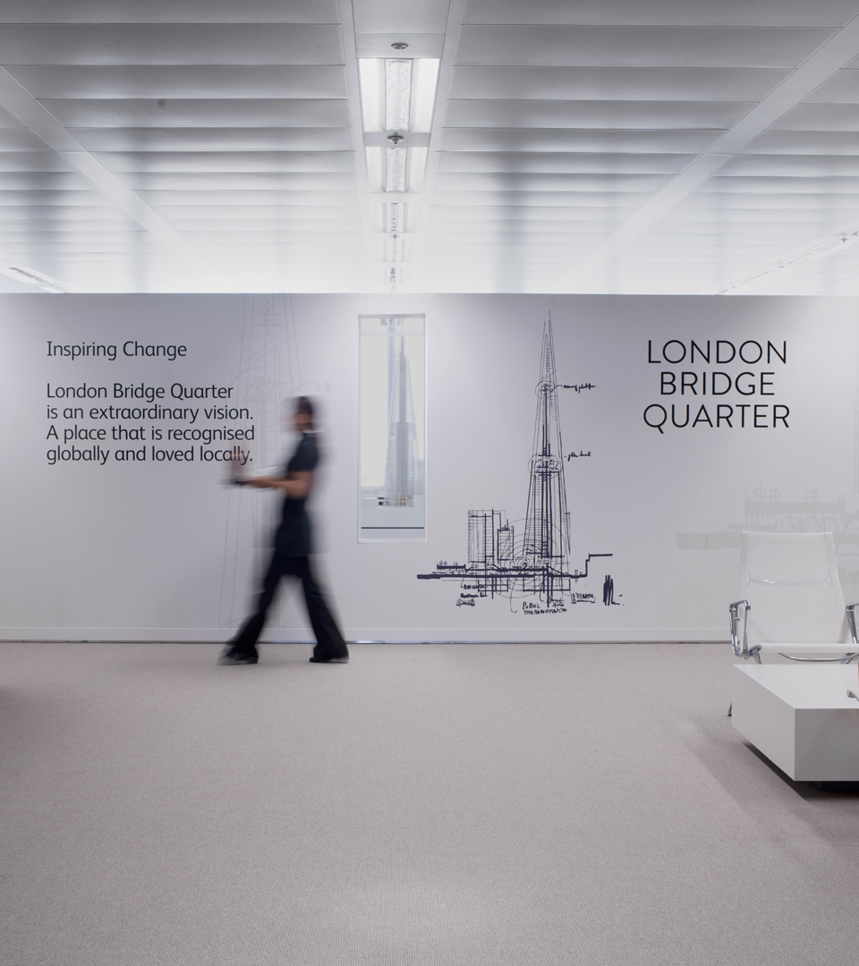
Changing London’s skyline – and its vocabulary
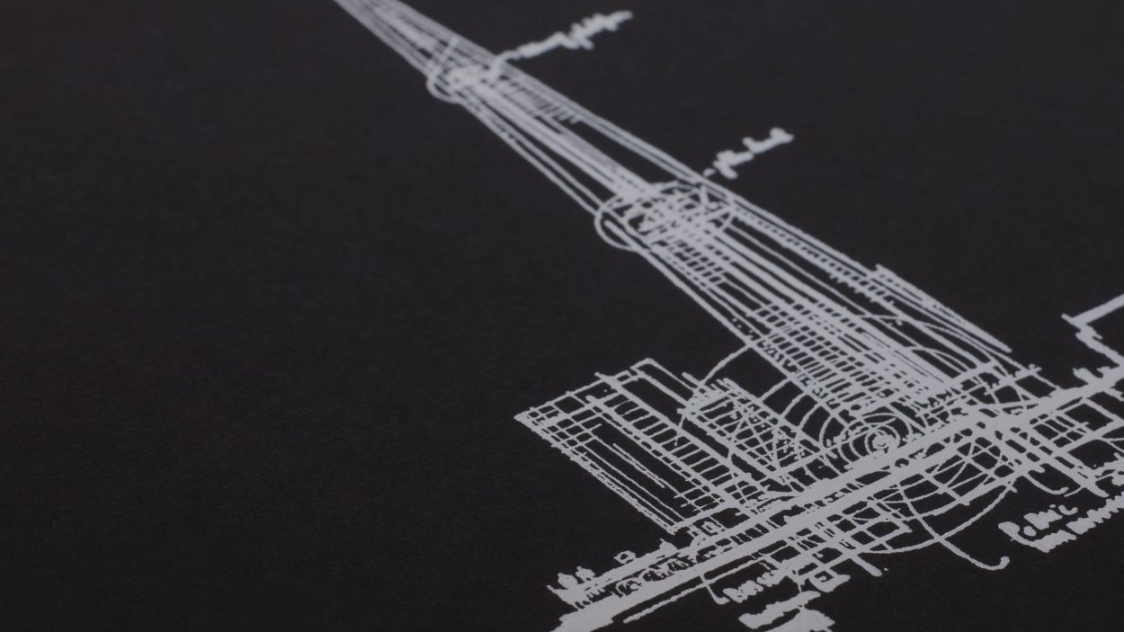
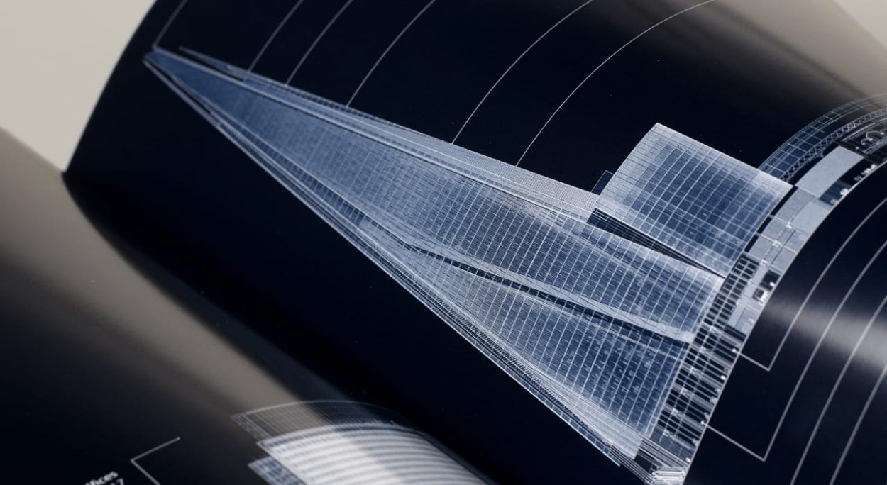
In 2005 we were engaged to create a marketing campaign for “London Bridge Tower”, a groundbreaking design that, according to its architect, Renzo Piano, resembled “shards of glass”.
This description had been picked up by the press, and people were starting to talk about ‘Renzo’s shards of glass’. We advocated strongly for adopting this, harnessing the attention and calling the building The Shard. Ultimately we believed that this extraordinary building deserved an extraordinary name. It took some cajoling, but eventually we prevailed.
- Branding
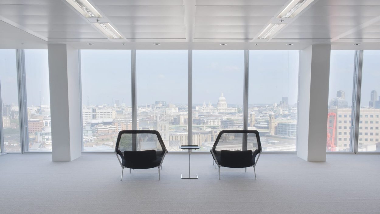
- Brochure Design
- Marketing Suite
- CGI Renderings
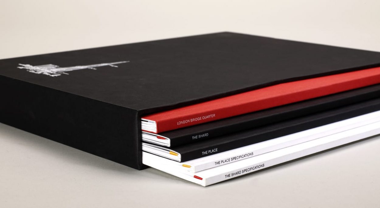
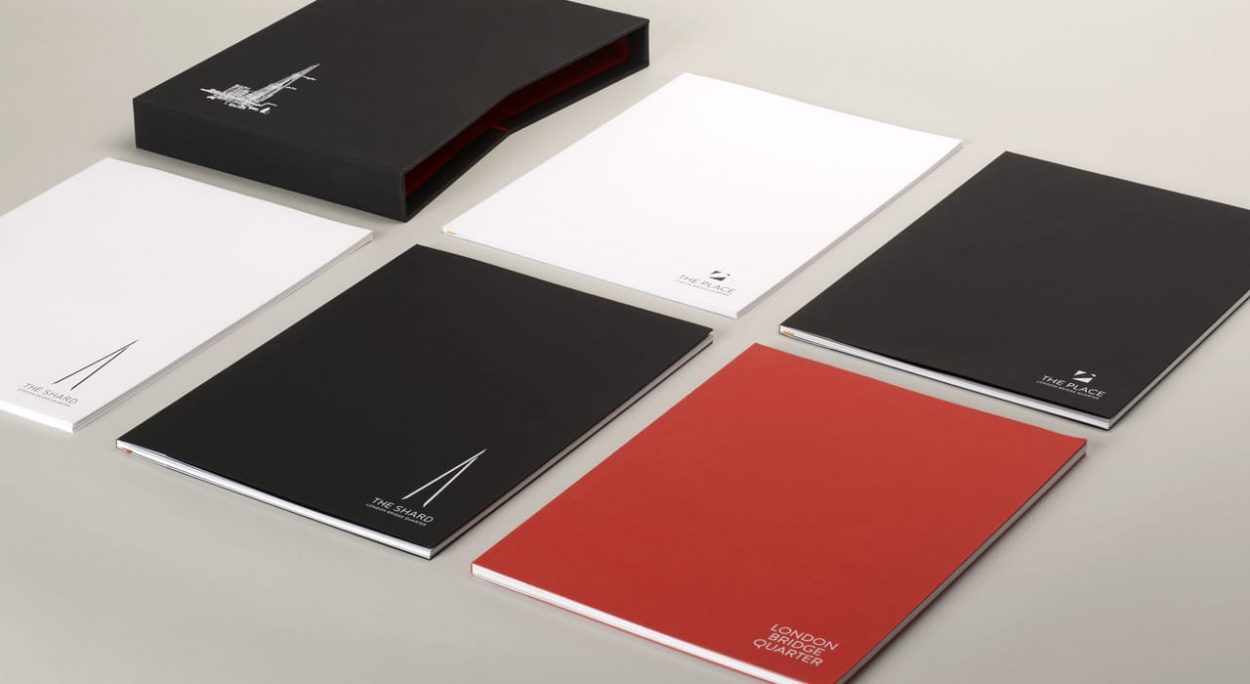
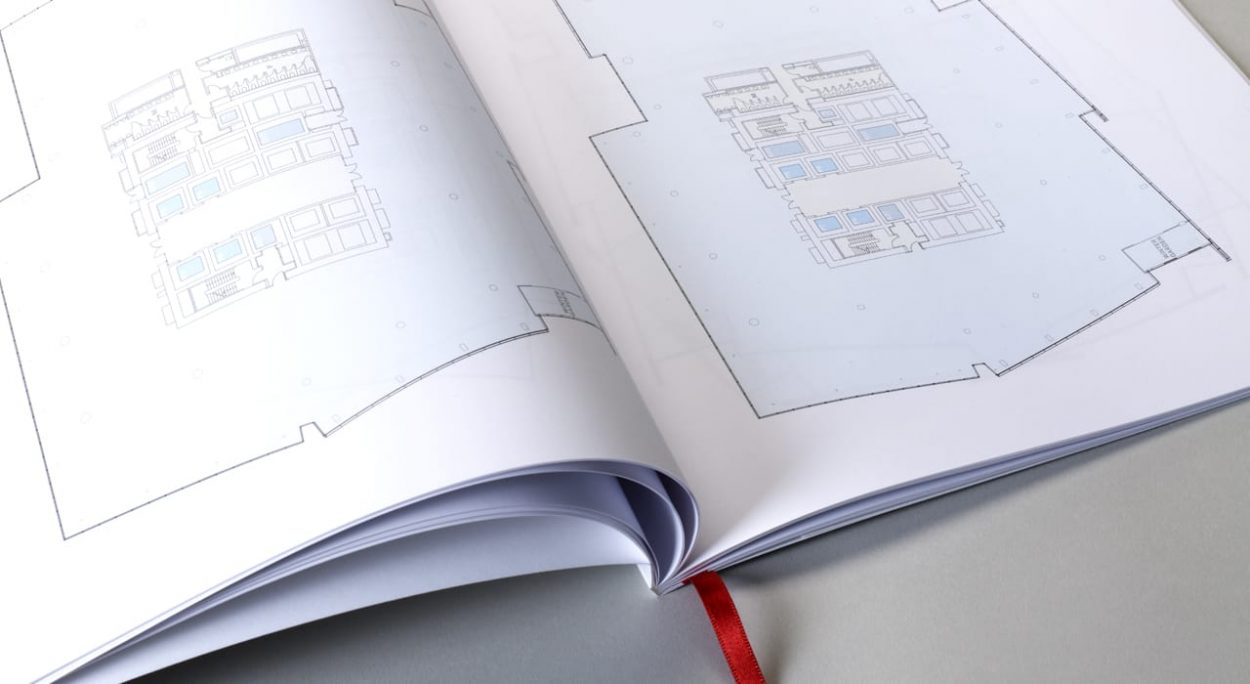
A 10 year partnership
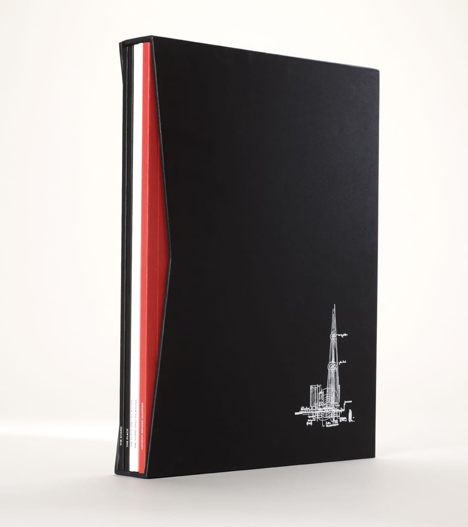
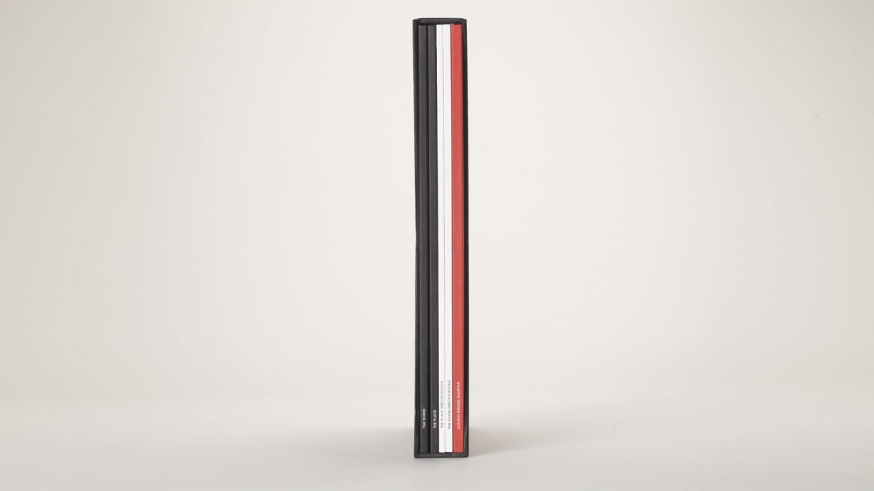
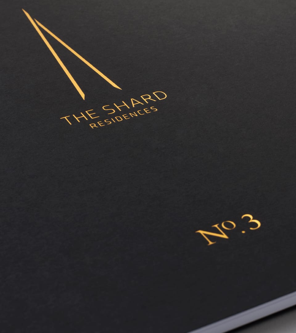
Over the 10 years we worked on The Shard we created a range of materials, from hoardings that enveloped London Bridge station to investment packs, leasing collateral for the offices to individual brochures for each of the 16 residences, interactive presentations to a coffee table book to celebrating Shangri-La’s entry into the London market.
But most of all, we are proud to have made our mark on the lexicon of they city.

Related projects
Let's Talk
Do you have a potential project or media enquiry to discuss?
Get in touch